well I'm about to get picky, as it's already probably as good as it needs to be,
and I already think it's pretty good, but here are the first things I'd say if you wanted to push it further.
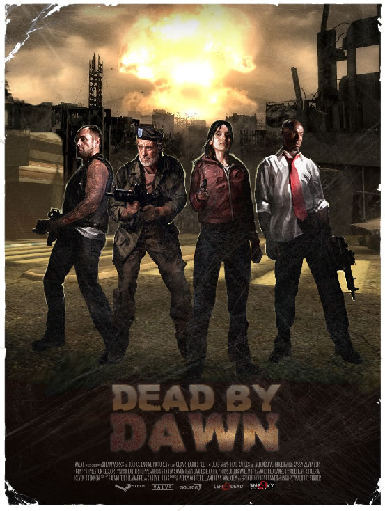
now either you can match the people to the background, or the BG to the people, but personally I think the BG is better so would match the people to the BG.
match the blacks by taking some blue out of them on the people. the BG has less blue.
after matching them, i'd lift the BG black levels a bit. some of the buildings are pretty far away, and look like they have darker blacks then the people. atmosphere would prevent this in real life. oh and the shadows of the people. hmm i think they aren't quite matching up with the BG shadows of the buildings. i'm not sure, did you put those in? or was it just kinda dark on the bottom half of the BG the way you found it?
match the highlights, specifically louis. needs more red in it. probably a little less blue aswell. that BG explosion is making the whole image orange. check the white markers on the street. they are going orange. they aren't as bright as louis' shirt so he shouldn't go that orange, but more towards that.
oh and maybe bring down the highlights on louis. he's a bit blow out. nothing in the picture should have higher values then that explosion. i dont think louis' values are, but they are close. probably too close.
i'd say it's all about matching the levels of the two elements on this shot. everything else looks good. you just need to work on the black levels and the highlights and then it will really sit them in there. midlevels look pretty good (although that might need adjusting once the black levels and highlights are adjusted, would have to see it.)
haha ok i'm really being picky.. but i'm at work, and we sit in a big theatre and pick eachothers work apart all day.. but sometimes small adjustments to blacks and highlights can really sell that last little bit


