 Jan 20 2009, 10:23 PM Jan 20 2009, 10:23 PM
Post
#1
|
|
 Security and Projects           Group: Clan Dogsbody Posts: 4,701 Thank(s): 1104 Joined: 31-August 07 From: A Magical Place, with toys in the million, all under one roof Member No.: 1 |
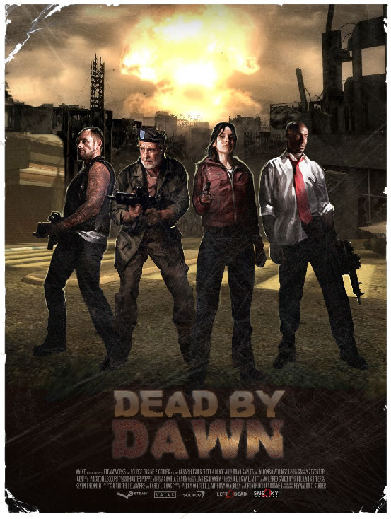
Since my sad life revolves around coding, its nice to play with arty-farty programs once in a while... so since the SDK for left 4 dead isn't out yet, I thought I'd have a mess around with a campaign poster, since if we do get some maps out we'll need to make one:
 and I know theres some bad brushwork to the left of francis, but having a low attention span, I got bored and decided to work on some mods --------------------  |
|
|
|
 |
Replies
 Jan 21 2009, 11:52 AM Jan 21 2009, 11:52 AM
Post
#2
|
|
 Knight Errant        Group: SM Guild Members Posts: 543 Thank(s): 0 Joined: 29-October 07 Member No.: 32 |
well I'm about to get picky, as it's already probably as good as it needs to be,
and I already think it's pretty good, but here are the first things I'd say if you wanted to push it further. now either you can match the people to the background, or the BG to the people, but personally I think the BG is better so would match the people to the BG. match the blacks by taking some blue out of them on the people. the BG has less blue. after matching them, i'd lift the BG black levels a bit. some of the buildings are pretty far away, and look like they have darker blacks then the people. atmosphere would prevent this in real life. oh and the shadows of the people. hmm i think they aren't quite matching up with the BG shadows of the buildings. i'm not sure, did you put those in? or was it just kinda dark on the bottom half of the BG the way you found it? match the highlights, specifically louis. needs more red in it. probably a little less blue aswell. that BG explosion is making the whole image orange. check the white markers on the street. they are going orange. they aren't as bright as louis' shirt so he shouldn't go that orange, but more towards that. oh and maybe bring down the highlights on louis. he's a bit blow out. nothing in the picture should have higher values then that explosion. i dont think louis' values are, but they are close. probably too close. i'd say it's all about matching the levels of the two elements on this shot. everything else looks good. you just need to work on the black levels and the highlights and then it will really sit them in there. midlevels look pretty good (although that might need adjusting once the black levels and highlights are adjusted, would have to see it.) haha ok i'm really being picky.. but i'm at work, and we sit in a big theatre and pick eachothers work apart all day.. but sometimes small adjustments to blacks and highlights can really sell that last little bit |
|
|
|
Posts in this topic
 MonkeyFiend Playing round with L4d Posters Jan 20 2009, 10:23 PM
 fido77 looks good monkey!!! Jan 21 2009, 04:25 AM
 Magik5 not bad at all, may have a go at a few of these at... Jan 21 2009, 09:11 AM
 =R6= Raile pretty good.
you want feedback?
or just showing ... Jan 21 2009, 11:11 AM
 MonkeyFiend was mainly just seening how easy it would be to ma... Jan 21 2009, 11:26 AM
 Magik5 are the buildings etc screen grabs from the game?
... Jan 21 2009, 11:45 AM
 MonkeyFiend nope, the building are mishmashed from other place... Jan 21 2009, 11:53 AM
 =R6= Raile hey upon you just saying that, the BG looks pretty... Jan 21 2009, 12:00 PM
 MonkeyFiend I'm sure I can just click on autolevels and th... Jan 21 2009, 12:02 PM
 =R6= Raile hey well do you want to be a coder for the rest of... Jan 21 2009, 12:11 PM
 MonkeyFiend I don't suit berets or listen to Jazz, so woul... Jan 21 2009, 12:44 PM
 =R6= Raile wait when did i say i was a real man?
and yeah th... Jan 21 2009, 01:46 PM
 Magik5 asm is for pure, unconditional geeks. Jan 21 2009, 02:21 PM
  |

|
Lo-Fi Version | Time is now: 30th November 2025 - 06:56 PM |


